What was M.C. Escher’s art style?
M.C. Escher’s art style is graphic printmaking built on mathematical order. Defined by tessellation, impossible architecture, transformation, reflection, and infinity, his works combine realistic technique with paradoxical logic.
He drew with a realist’s discipline, composed like an architect, and treated the picture as a system that had to hold together. The result is unmistakable: tessellations that lock without gaps, impossible constructions that remain calm while breaking space, transformations that glide from one motif to another, and reflections that fold a whole room into the curve of a palm.


What style of art is M.C. Escher?
Escher worked in graphic art, woodcut, wood engraving, lithograph, and mezzotint, applied to problems of symmetry, perspective, and infinity. He is neither a painter of moods nor a symbolist; he is a draughtsman of rules. The M.C. Escher style of art takes real-world drawing and puts it in the service of paradox: each small part obeys ordinary vision, while the whole reveals a different logic. In plain terms: realistic marks, conceptual premises.

The pillars of his style
Escher’s language can be seen as five interlocking pillars. They appear separately and in combination; together they define what people mean when they ask what style of art did M.C. Escher do.
Tessellation and the regular division of the plane
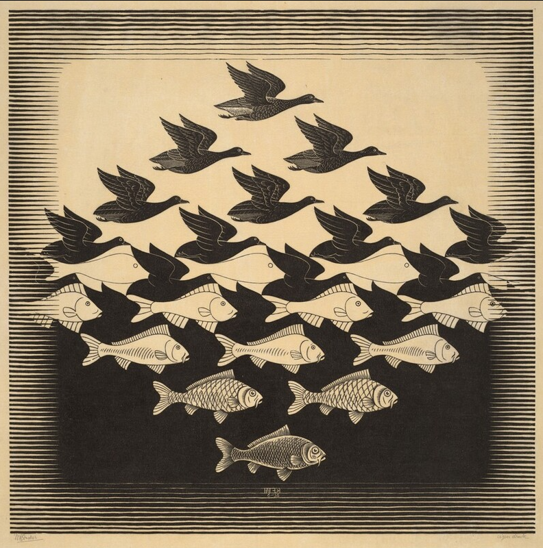
Tessellation is the tiling of a surface with no gaps or overlaps. Escher’s leap was to replace abstract polygons with birds, fish, lizards, and human profiles, then push beyond static repeat into evolution. In Sky and Water I, white birds bloom from the negative space that will soon become black fish; figure and ground trade jobs in the middle zone. The edge economy, one line serving two figures, is the essence of his craft.
Reflection and recursion
Mirrors let Escher bend space without breaking it. In Hand with Reflecting Sphere, the world wraps onto a palm; in Drawing Hands, two hands rise and draw each other into being; in Print Gallery, the scene spirals back into itself. These are essays on self-reference done with a realist’s restraint.
Infinity and the feel of unbounded space
The Circle Limit series models patterns in a hyperbolic disk: motifs shrink toward the rim, suggesting endless continuation inside finite paper. Elsewhere he uses Droste-like spirals and open repeats to hint at infinity as a rule carried to its limit, not a special effect.

Impossible architecture (optical paradox)
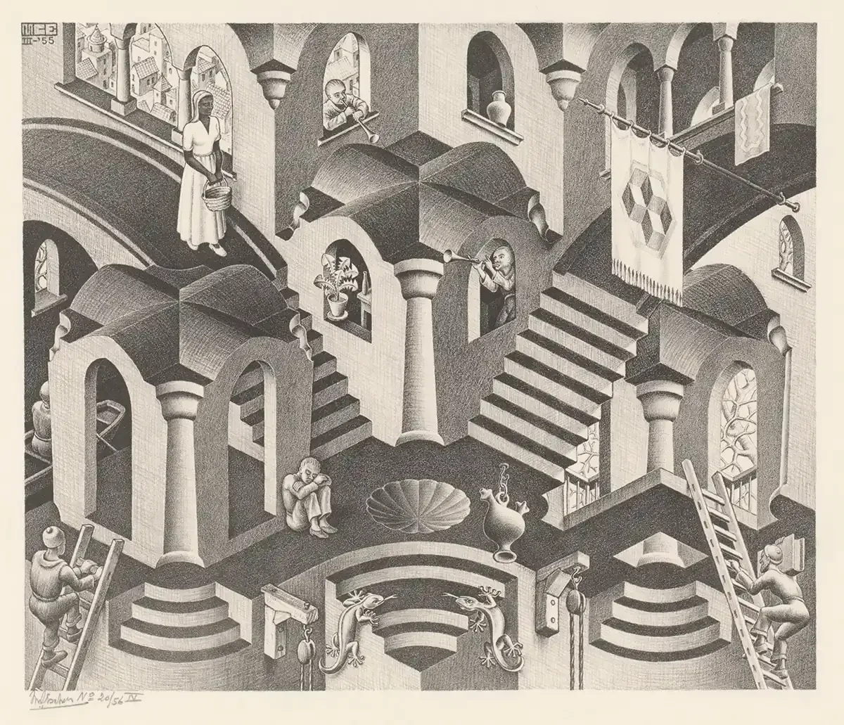
Escher builds rooms that honour local perspective and defy it globally. Relativity nests several gravity directions inside one building; Ascending and Descending loops a stairway across a roof; Waterfall routes an aqueduct “uphill” by embedding Penrose triangles. These images persuade because the details behave: rails join columns, shadows fall consistently, and bricks line up.
Transformation and metamorphosis
Instead of panels and captions, Escher uses continuous change. A checkerboard grows wings, wings narrow into architecture, and architecture returns to pattern. The Metamorphosis prints are journeys where every step is small and the destination feels inevitable.
What techniques did M.C. Escher use?
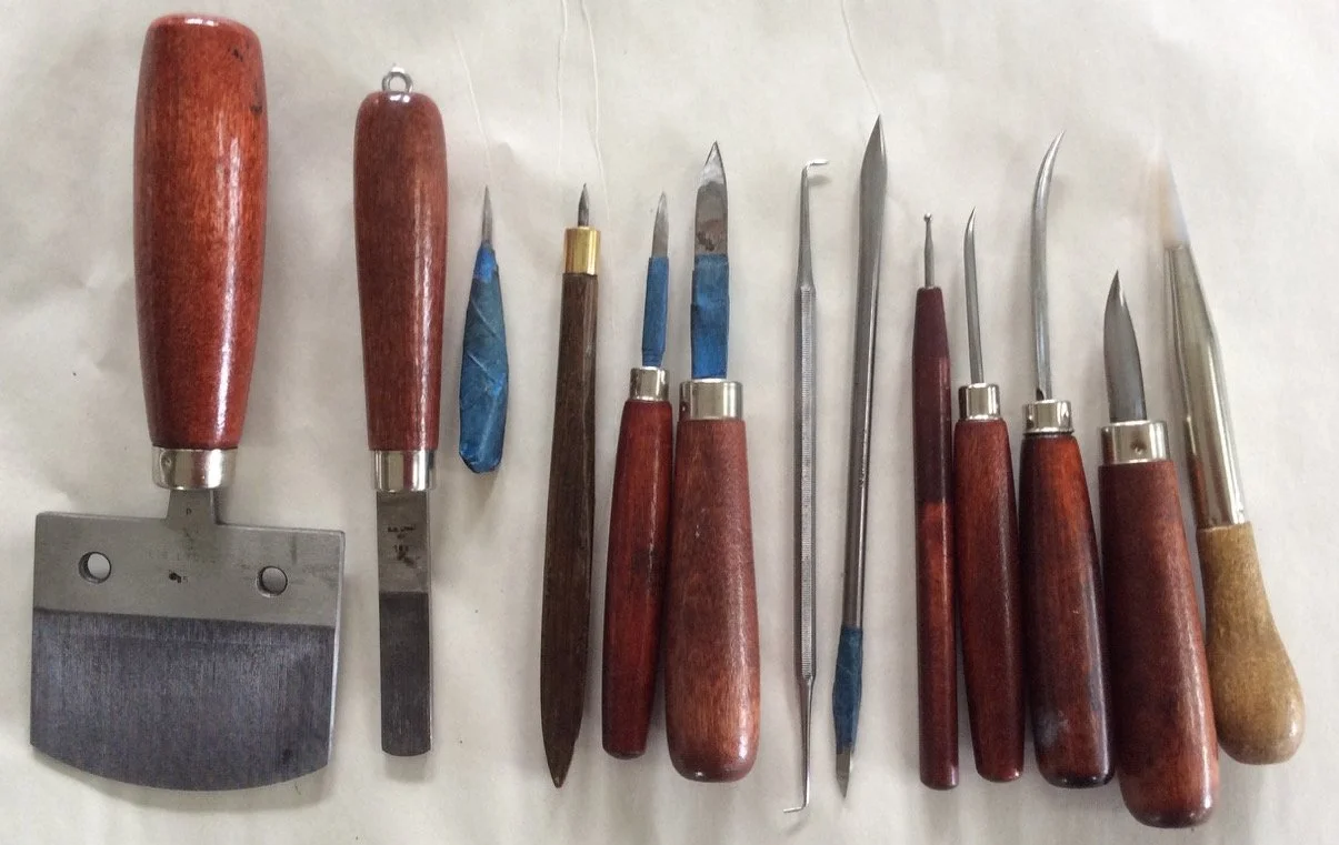
Escher’s style is inseparable from his techniques. He primarily used woodcut, wood engraving, lithograph and mezzotint.
He chose the process that matched the problem, and he worked it until no seam showed.
Woodcut
A relief process with bold line and emphatic rhythm. Woodcut gives Escher the crisp borders and repeatable unit shapes that tessellation demands, and the long horizontal reach needed for the Metamorphosis panels. He sometimes registered multiple blocks for color without losing edge discipline.
Lithograph
Drawn on limestone, printed by exploiting the opposition of grease and water. Lithography provides continuous tone and believable interiors, which is why Relativity, Drawing Hands, Ascending and Descending, and Waterfall use it: the tonal calm helps the paradox read as ordinary.
Mezzotint
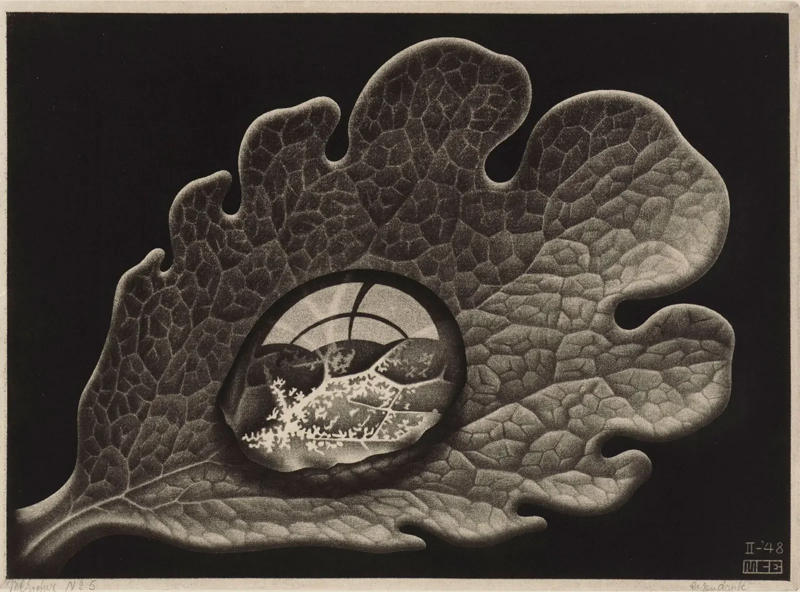
The plate is roughened to print black; the artist burnishes the light out. Mezzotint grants velvet blacks and photographic presence, perfect for the solemn gaze of Eye. Escher used it sparingly but with authority.
Wood engraving
End-grain blocks and burins yield hairline detail and miniature control, useful when a transformation must be advanced one notch at a time or when tiny textures matter. Think of it as woodcut’s precision cousin.
How Did M.C. Escher Make His Art?
Escher’s process was anything but glamorous. It was methodical, faithful, and iterative. He began with study drawings, testing edges, and refining forms. He prepared blocks and stones, pulled proofs, corrected, and tried again. He wasn’t chasing lucky effects; he was constructing them. That’s why his finished prints carry such confidence: every excess stripped away, only what mattered left behind.
For a deeper dive into technique, how a woodcut differs from a wood engraving, how lithography creates tone, how mezzotint builds darkness, or why perspective grids mattered, you’ll find it on the Art Style page. You don’t need that knowledge to enjoy the images. But once you have it, the pleasure sharpens; you see where the craft ends and the audacity begins.
Was M.C. Escher a surrealist?
No, at least not in method. Surrealists lean on dream logic, chance and free association. Escher’s pictures propose explicit systems and then work them to the edge. The mood can feel surreal because the world depicted is not our own, but the procedure is architectural and mathematical. If you need a label: Escher is a realist of impossible premises.
Composition and tone
Escher composes with axes and balance. Even the most baroque prints keep a steady pulse: repeating forms act as metronomes; light falls consistently; paths for the eye are clear. The tone is restrained. He avoids theatrical chiaroscuro unless the technique demands it (mezzotint), and he declines expressive flourishes that would draw attention away from the structure. That modesty is part of the persuasion: the pictures seem to be telling the truth, so when they contradict reality, the contradiction feels earned.
Who influenced Escher’s work?
A few biographical facts explain the style without romanticizing it.
Architecture first. Escher began in architecture school in Haarlem before switching to printmaking under Samuel Jessurun de Mesquita. Architecture left him with a taste for load-bearing clarity and a love of stairs, arches, and street plans.
Italy’s interiors. Years in Rome and travels through hill towns gave him a storehouse of stair runs, courtyards, and rooflines—the raw material later abstracted into paradox.
The Alhambra’s patterns. Copying Islamic tilings taught him symmetry groups by hand; replacing polygons with living figures made the result personal.
Mathematical dialogue. Mid-century mathematicians recognized their concerns in his pictures and offered new toys—the Penrose triangle and stair—plus the confidence that the work mattered beyond art.
5 tips to understand an Escher print
Before you decide what it “means,” confirm how it works. Five quick habits make the style snap into focus:
Follow edges. In tessellations, trace where a single edge serves two figures; in architecture, trace handrails and lintels as they change allegiance.
Check light. Shadows are honest. If two surfaces disagree, look for the privileged viewpoint that reconciles them.
Scan for units. Stairs, beams, tiles—Escher builds from modules; spotting them reveals the engine.
Look for the hand-off. Where does bird become fish, pattern become city, drawing become reality? The change is usually designed to be unfussy.
Ask what rule you’re being asked to accept. Once you articulate it, the picture is fluent.
Hallmark works and how they embody the style
It helps to see the pillars at work in specific prints. Each title below links to a focused article.
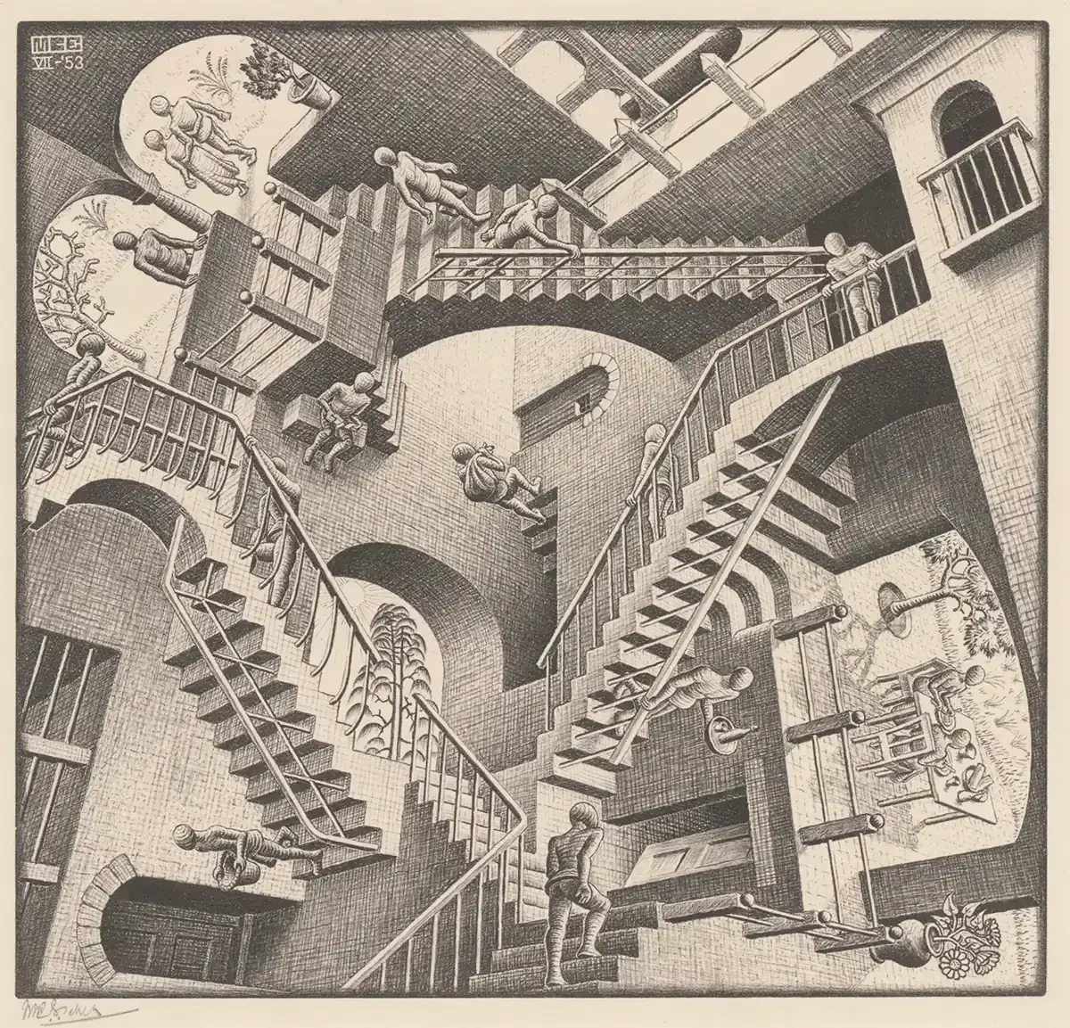
Relativity. Lithographic tone sells calm interiors while stair units reattach in ways that keep the building coherent locally and impossible globally.
Drawing Hands. A compact statement of recursion: two hands rising from paper, articulating each other into being. Lithographic mid-tones keep the scene believable.
Waterfall. Two Penrose triangles embedded in the aqueduct force water uphill; the architecture around them remains textbook-correct.
Sky and Water I. Tessellation becomes narrative: birds and fish trade places across the center, an object lesson in figure/ground.
Ascending and Descending. The Penrose stairs loop across a roofline; robed figures climb forever in opposite directions.
Bond of Union. A ribbon rotates through space to build two faces: no paradox, just spatial music and precise light.
Belvedere. A peaceful structure whose beams cross in impossible ways; the deception is gentle and thorough.
Three Worlds. Surface, reflection, and depth coexist; not a trick, a reminder that perception stacks realities.
Reptiles. Flat lizards step into the world and back into the drawing: Escher’s manifesto on paper.
Eye. Mezzotint’s velvet blacks make a skull inside the pupil feel inevitable.
Hand with Reflecting Sphere. A self-portrait that doubles as a primer on curved perspective.
Why the illusions hold (instead of collapsing into tricks)
Two reasons: local truth and composure. Escher draws each small piece correctly—perspective, shading, texture—so your eye signs off before the contradiction arrives. And he presents the whole without fanfare. The picture behaves as if everything is normal; your brain adapts. That is the hallmark of the MC Escher style of art: a paradox that keeps its dignity. These ideas resonate with esoteric traditions such as tarot cards, where geometry and archetypes are also central.

What style of art is Relativity?
Relativity (1953) is a lithograph in Escher’s vocabulary of impossible architecture. Each figure moves rationally within its own gravity, while the building admits several ‘‘downs’’ at once.
Local realism + single controlled viewpoint + global contradiction = a paradox that stabilizes rather than collapses
